Jan 24, 2024
Scaling Vidyard Home Dashboard for all roles and tiers
Working with 6 devs as a Sr. Product Designer at Vidyard. Turning an experiment into a long-term product presence. Improving the overall experience and 2x the new user activation metric.

Context
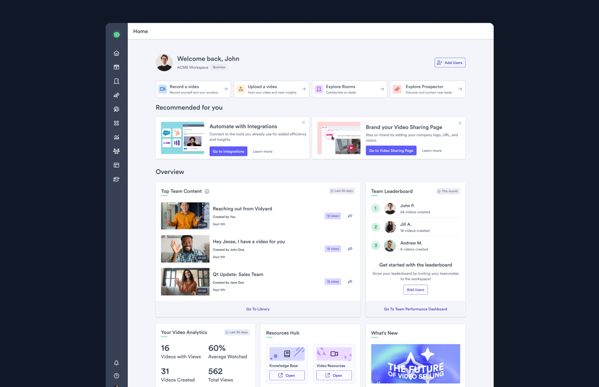
In early 2024, we launched Vidyard Home as an experiment for the Free workspace tier, aiming to test how a centralised starting point could enhance user engagement. Despite being built and shipped in just 6 short weeks, the experiment achieved a 12% improvement in retention, showcasing its potential impact.
As a video recording tool for B2B sales, Vidyard serves a diverse user base, from individual Free and Pro accounts to large-scale Plus and Enterprise teams. Building on the experiment’s success, we were on a mission to design a scalable, holistic experience that shows the right content to the right user at the right time—supporting users from their first sign-up to the “aha moment” of becoming deeply engaged customers.
Zooming Out Before Moving Forward
While the experimental MVP design had proven effective, scaling Vidyard Home required addressing a series of broader questions as it is longer serve one type of customers:

- Who are we designing for? What are their daily workflows, and how does Vidyard fit in?
- Where are they in their engagement cycle? What’s the key action we want them to take next?
- What’s the purpose of each component? How should it guide users through Vidyard’s ecosystem?
- What does the data and feedback tell us? What opportunities for improvement have emerged?
- What’s our timeline and scope? How can we deliver effectively while mitigating risks?
Returning to the drawing board, we created flow charts and mapped out user journeys to ensure every aspect of the Home page was purposeful, impactful and scalable.
Overcoming Challenges
The primary challenge was designing a centralised experience that seamlessly catered to both self-serve small teams and complex, multi-layered enterprise workspaces, each with distinct systems and setups.
This challenge was further heightened by Vidyard’s evolution into a multi-product platform, with offerings like Rooms, Prospector, Video Hosting, Video Messaging, and AI Avatars—all competing for user attention. Ensuring that Vidyard Home remained focused and purposeful was critical to avoid it becoming a “dumping ground” for these competing priorities, which could dilute its effectiveness and user impact.
After aligning with the Product and dev team, we soon found the goals of our solution:
Identify opportunities & put ideas in milestones
We structured the project into clear milestones, allowing us to iterate and deliver meaningful updates quickly:
Milestone 1: Accessible CTAs for a Quick Win
Adding Call-to-Action (CTA) cards to improve feature discoverability. These cards provided immediate access to Vidyard’s core features, addressing gaps in the MVP where users struggled to explore the platform’s offerings.
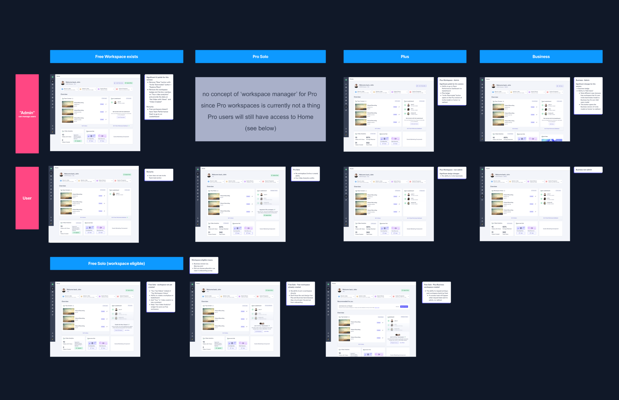
Milestone 2: Scaling Across Tiers
Rolling out tailored versions of Vidyard Home for different tiers (Pro/Plus/Enterprise) and roles (Admin, Member). This involved accommodating user permissions, team structures, and folder settings, ensuring that each tier’s experience felt personalised and relevant.
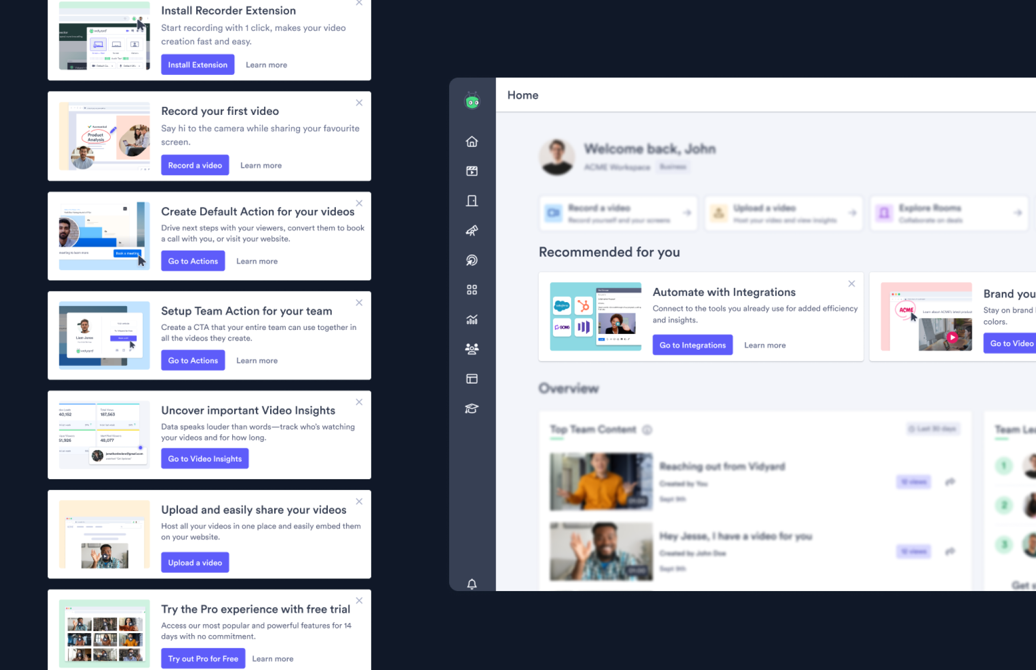
Milestone 3: Customised Activation Flows
Streamlining the onboarding process by consolidating checklists and admin pages. We aimed for cleaner code, clearer user journeys, and improved feature adoption through intuitive next steps.
Results and Impact
After 8 weeks of development—and overcoming technical hurdles (Turns out it is not that easy to query who is the team top creator in a 500 people team), we successfully shipped Vidyard Home for all tiers.
“We loved and were very impressed with the onboarding checklists and the embedded training videos, it was such a good user experience.” Key Perry, Senior Manager, Customer Success, Auditboard
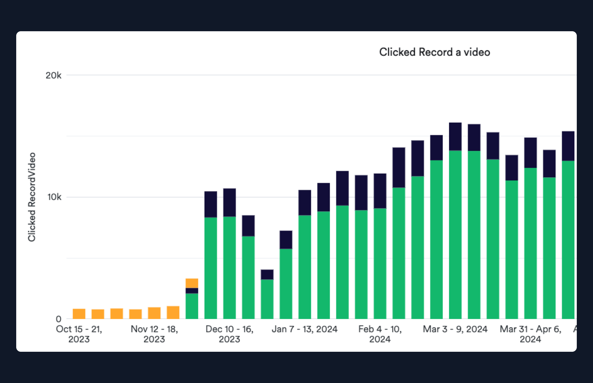
13K
Weekly clicks on the Recent Workspace Component & CTAs respectively
66%
Unique users click on Record CTA when they visit Home
2x
D0 Creation for new users, while Recording Start-to-finish Rate remains 80%
+3.2%
Increase on overall DAU, most lies in Free Workspace
Through this process, we bridged gaps in Vidyard’s experience, creating a Home page that not only supports immediate user needs but also drives long-term engagement across our diverse customer base.